Google Chrome is now my default browser. I’ve been a die-hard IE user since 4.0. Firefox never even won me over, not in the slightest. But there are several aspects of Google Chrome that make it seem very natural for me. Plus, it’s fast—really fast, and that never hurts.
First, the overall UI is so trim and light-weight; it lets you focus on the content and not the browser. The way they flipped the tabbed browsing upside-down makes perfect sense. It’s one of those things were once you see it, you realize how backwards the other browsers have been with tabbed browsing. You start to wonder about other tabbed interfaces too, thinking about how they could be improved if they were set up like Chrome. And the way the tabs bleed into the window glass is just slick and makes the window feel like it’s not wasting any space. IE on the other hand, has always felt “heavy” like it wastes a lot of space.

Second, the “home page” that you see when you open a new window or a new tab. Brilliant! Not sure what else to say, just absolutely brilliant. I rarely need to start browsing from something other than the 9 sites it shows me. And identifying them by the last screen-shot of that site is awesome.

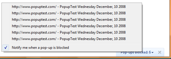
Third, the popup handling. They’ve recently changed this, and I don’t know if I like it better or worse than before, but I still love it. Instead of actually blocking popups, they let em run, they just don’t show them. So scripts on the main page run without error; and when you decide you want to see the popup, you don’t have to refresh the main page. You just click to say you want the popup and boom, there it is in full function. Check out www.popuptest.com to try it out.

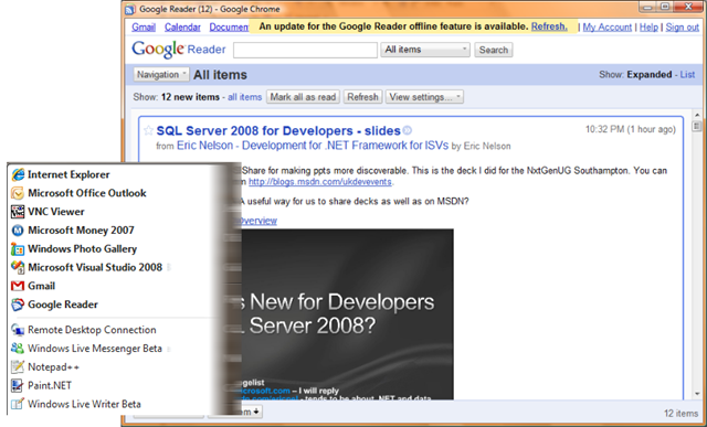
Fourth, the application shortcuts. I have shortcuts for Gmail and Google Reader. It’s great to have so much extra real estate for those two sites.

Fifth, the all-in-one search and address bar. The heuristics they use are dead-on. It’s an excellent mixture of domains, bookmarks, history, recent searches, search pre-fetching, and even intranet sites.

Sixth, the fact that it’s just freaking fast. Usability does come ahead of this for me, but it doesn’t hurt.
Seventh, the inline search function. They nailed this too. You just hit Ctrl+F, type, and the rest is very natural. The search box is very subtle, which is important, because the last thing you want is for your search box to open and A) get in your way of seeing the actual web page, or B) cause the window contents to shift around at all.

Eighth, the download handling. This one’s hard to capture in a screenshot. But when a download fires off, you get a button kind of thing at the bottom of the window. Multiple downloads can be docked down there concurrently. The icons clearly show status and how much time is remaining, but like the search function, there’s no dialog to get in your way. If your download is an exe, the behavior is a little different, and it’s very intuitive and efficient.

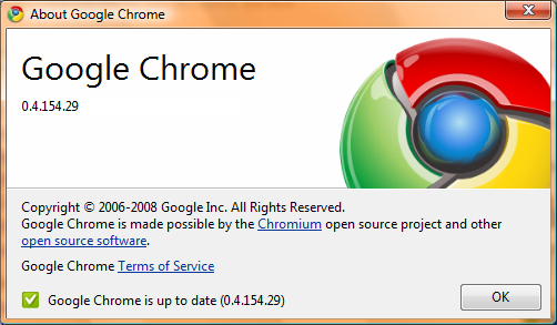
Ninth, the fact that it auto-updated and I never even knew that it happened. It’s like the benefit of using web applications (like all of the other Google products) where I don’t have to keep re-installing them for updates, except this is my browser. I have no idea when the update got installed that A) fixed the Silverlight support, or B) changed the popup handling, but I don’t really care—the updates got installed and I know things are up-to-date. It even tells me so.

And to round it out, tenth, the password memory and auto-fill. I didn’t think that I would like it, but I do. I like how it automatically fills out login forms for me when I’ve asked it to remember the username and password. This just builds upon the efficiency of the home page: I click on the screen shot for the desired site, and then click the login button, and I’m logged into the app. This saves me a lot of time.

There are a couple quirks that I don’t quite like, but compared to the things that I do like, they are very minor.
I miss the drop-downs on the back and forward stacks. Holding the mouse button down on the button gets annoying.Oh, wait, oh a whim, I just decided to try to right-click on the button and hey, it gives me the drop-down. Okay, scratch this one.I wish there was an easier way to close all of my open tabs, but leave a new tab open. When it’s time to change gears, I find myself opening a new tab and then saying to close all other tabs. It’s a few clicks and I’d like there to be a single keystroke or mouse click for this. When I only have 1 open tab, I essentially want a Home button that takes that tab back to the home page (the New Tab page).Okay, I just found that you can turn on a Home button in the toolbar from the Options. Wow, that was actually the first time I’ve even touched the options—that says something great about this browser right there. So anyway, scratch this one too. And wow, the options are simple and understandable.
I’ve also been impressed with the compatibility that existing websites have. And for that matter, Silverlight works like a charm (now). I hope that IE8’s release can go as smoothly as Chrome’s introduction has.
Update: I completely forgot to talk about now tabs work in Chrome. First of all, it's nice to rearrange the tabs into a different order sometimes. But you can also drag a tab out of a window entirely to break it out into a new window. This is something that I use to have a bookmarklet on my links tab for doing in IE, but it never worked quite right. You can also merge Chrome windows by dragging them into each other. Just like everything else in Chrome, this is exactly what you'd expect a browser to do if you had never used a browser before.